
No Ponto
A public transportation information system for an iconic city
2021
Problems
A city designed for private transportation, with no easy or intuitive information about its public transit.
Solutions
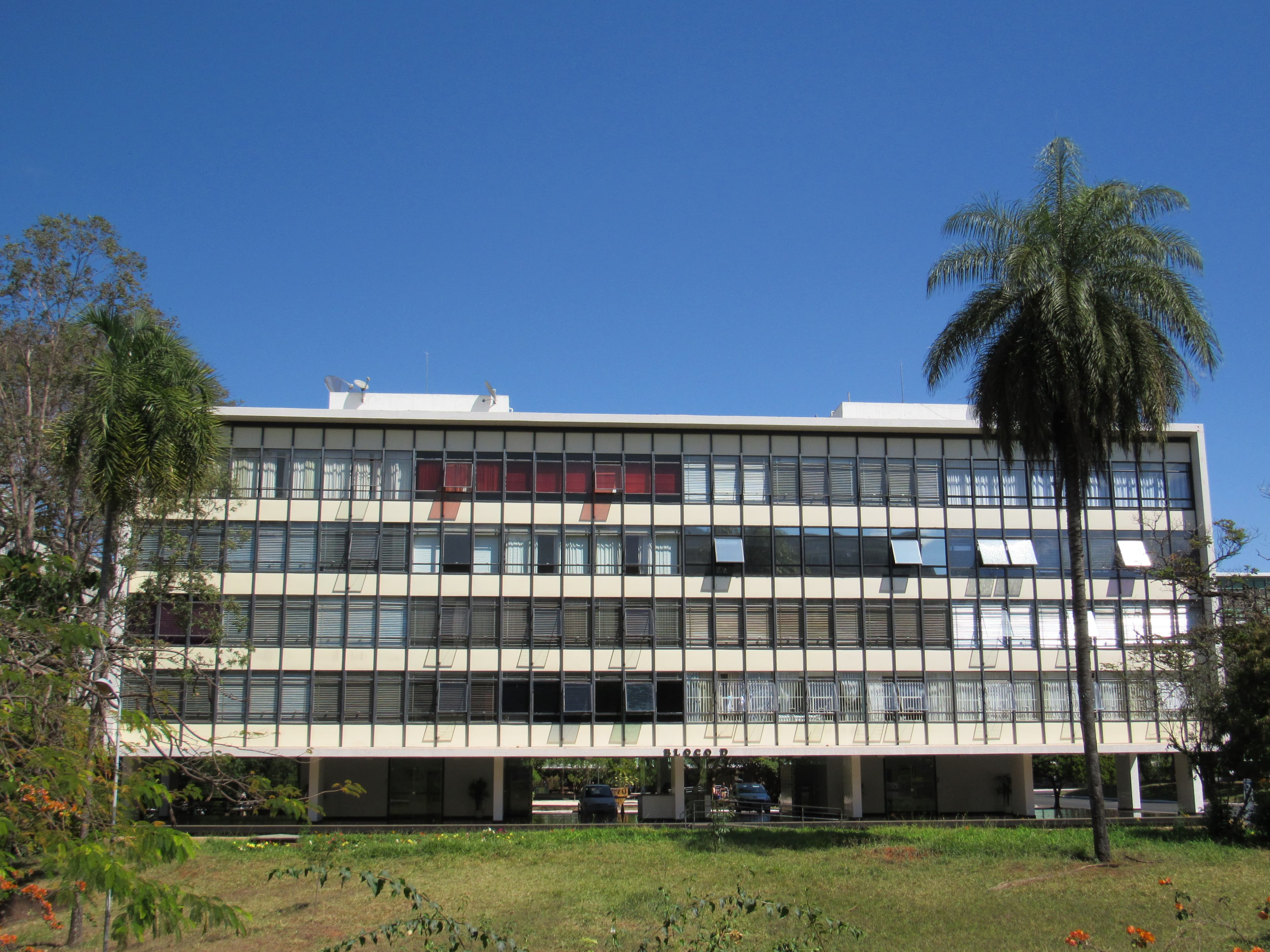
A system that provides intuitive information about public transportation and conveys the city’s culture and visual identity using symbols and icons that already exist in the city, reflecting what Brasília already is.
Results
It delivered a clearer, more customizable and intuitive wayfinding experience, along with a visual identity connected to the city's cultural and aesthetic context.
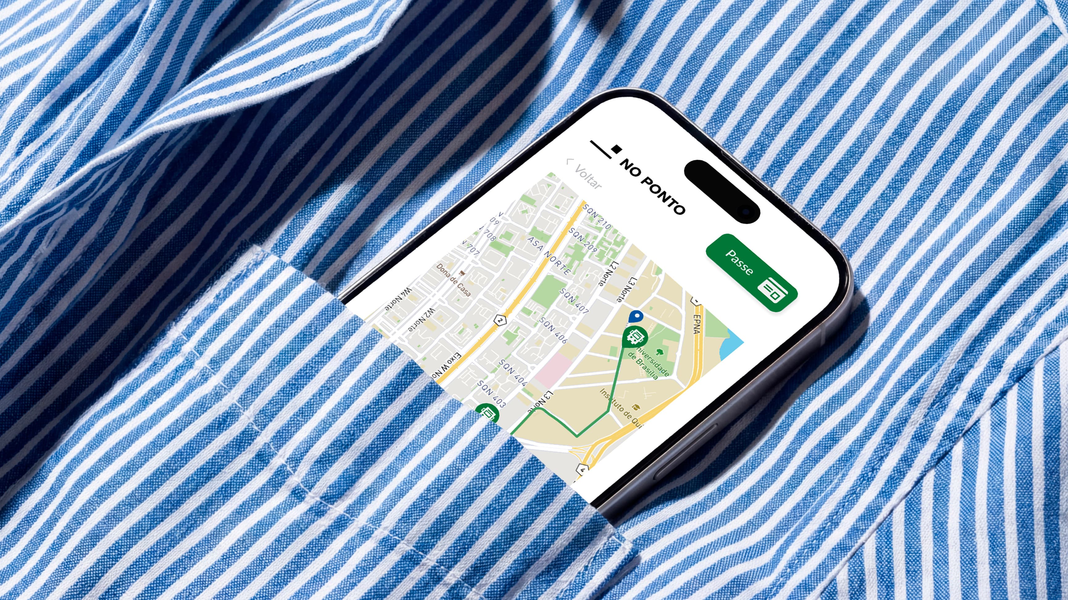
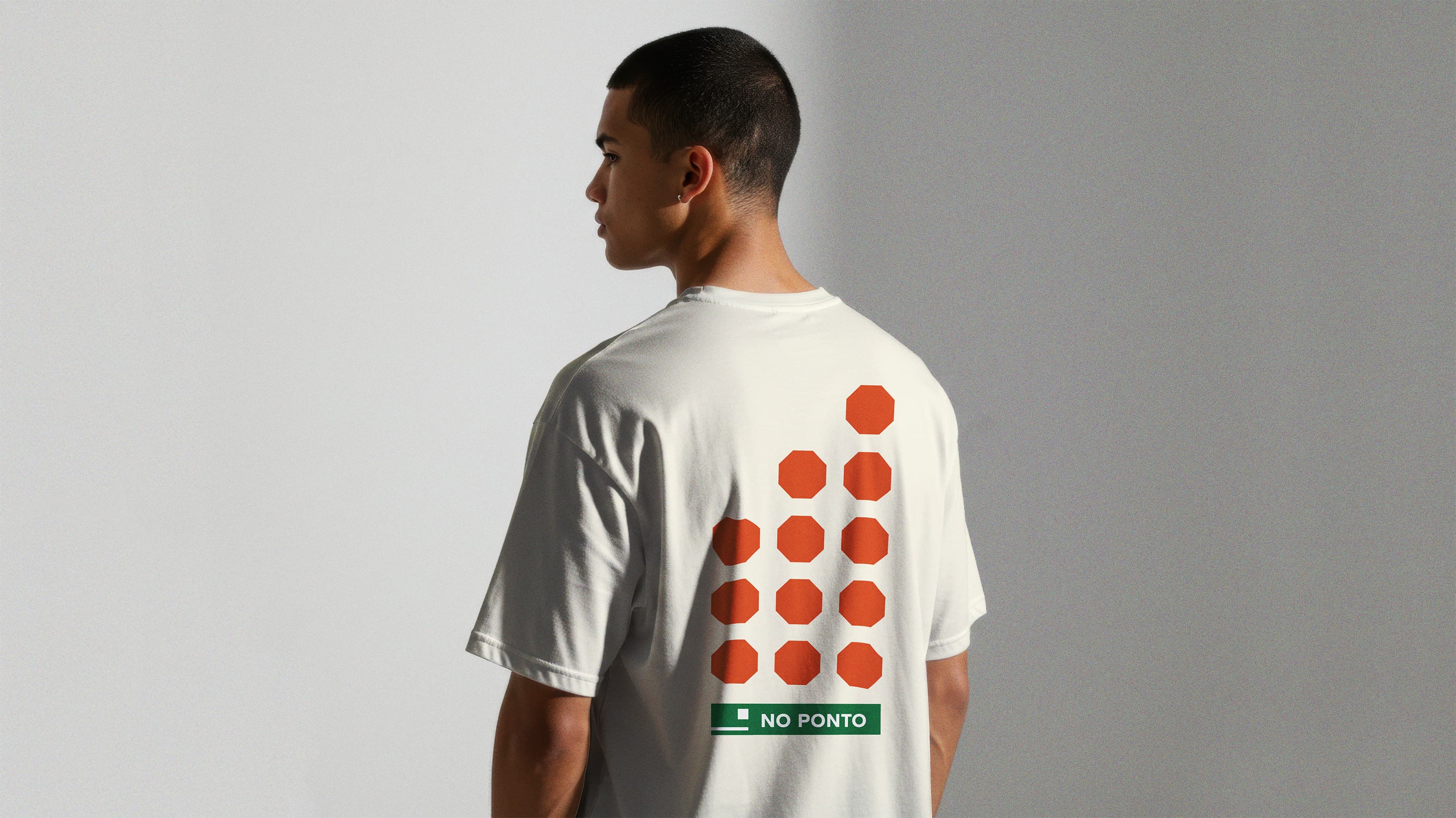
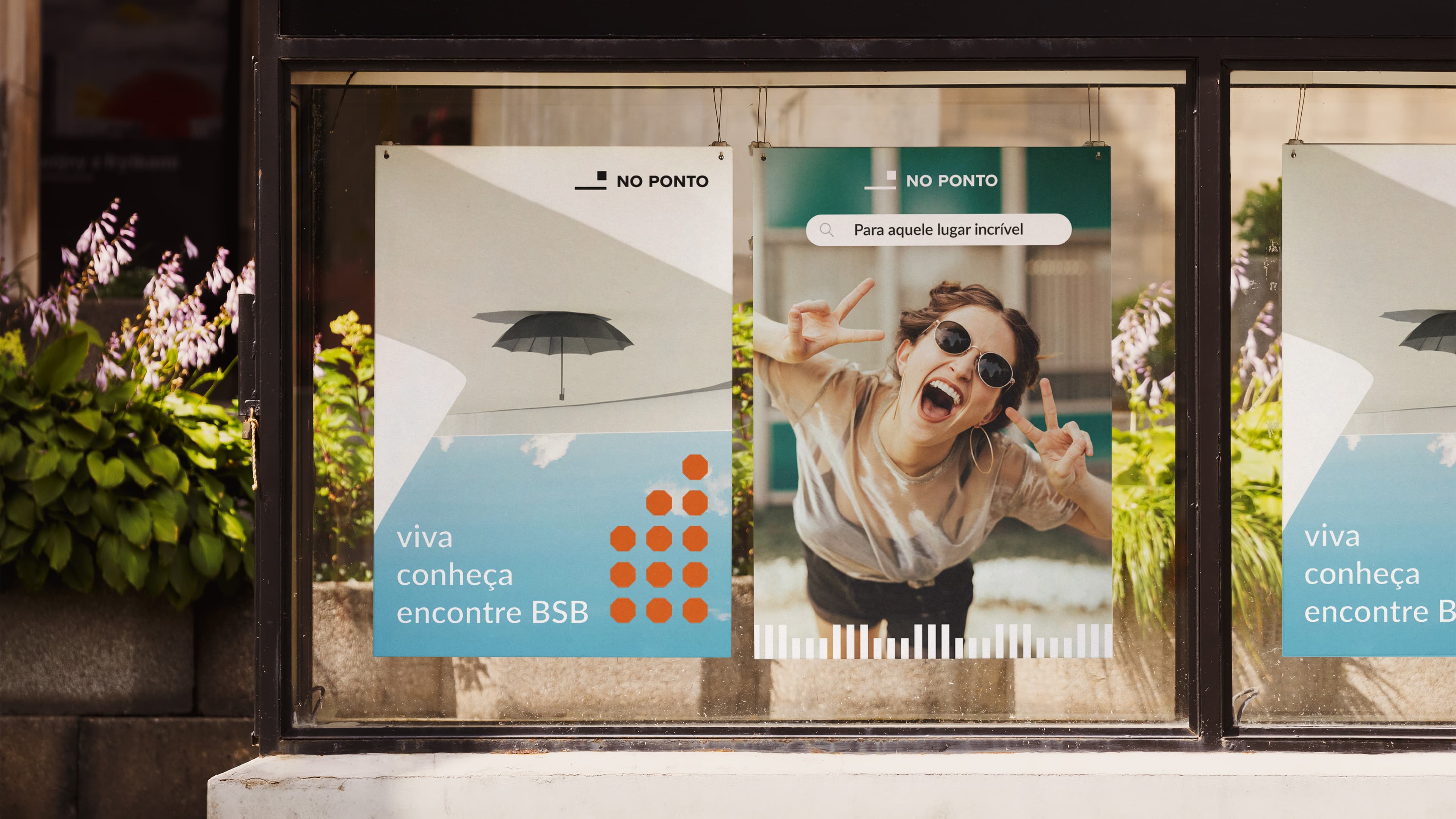
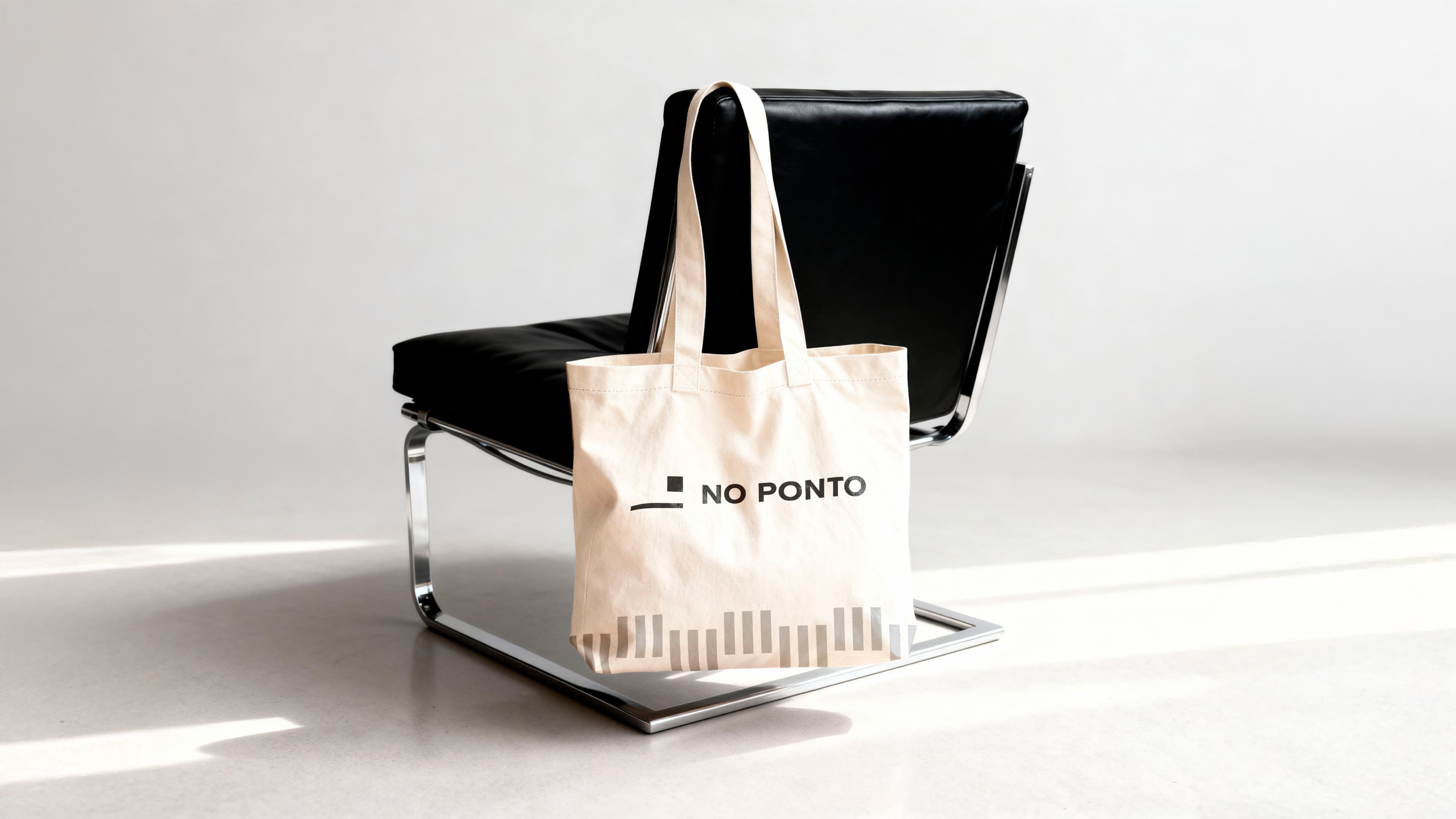
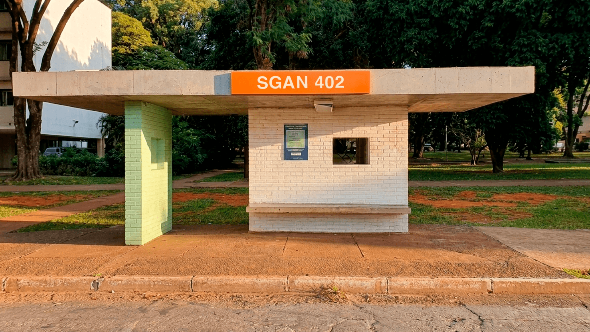
A multi-channel information system spanning a mobile app, an information totem, an interior bus route map and bus stop identification signs. The visual identity runs through every touchpoint, reinforcing the personality of a modernist city in the middle of the Brazilian savanna through minimal, rhythmic elements and warm, vibrant colors. The naming is direct, referring to the very place where you wait for the bus ("No ponto", means at the stop). The logo is a simplification of Brasília's most iconic (and heritage-listed) bus stop, designed by the great architect and urban planner Sabino Barroso.
Other projects