Lavolho
From category conventions to a clearer, more engaging brand system.
2026
Problems
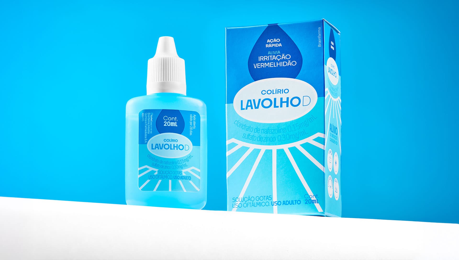
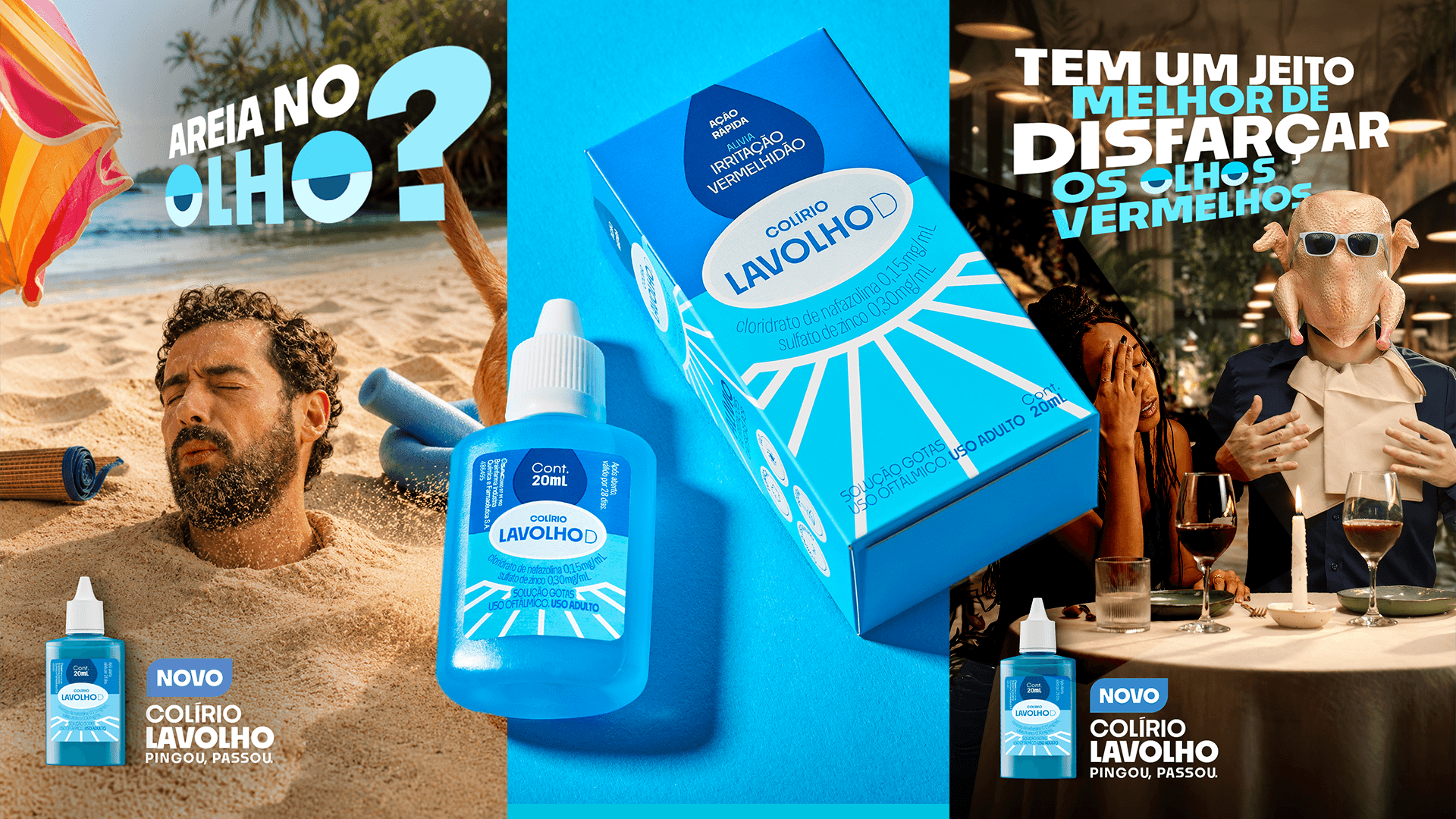
In Brazil's OTC eye-drop category, many products compete for attention without clearly communicating what they are designed to treat. For Lavolho, the challenge was to make the choice process clearer and more engaging, while creating a brand that could connect with a Gen Z audience through a lighter, more approachable tone. Through a competitive audit and shelf analysis, we identified both category conventions to leverage and opportunities to break away from. Blue was retained as a key category cue for soothing eye drops, while the information hierarchy, iconography, and overall visual language were redesigned to create greater distinction and clarity.
Solutions
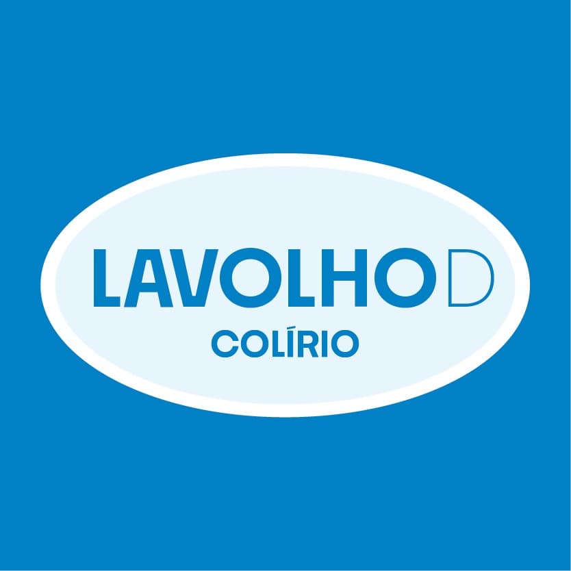
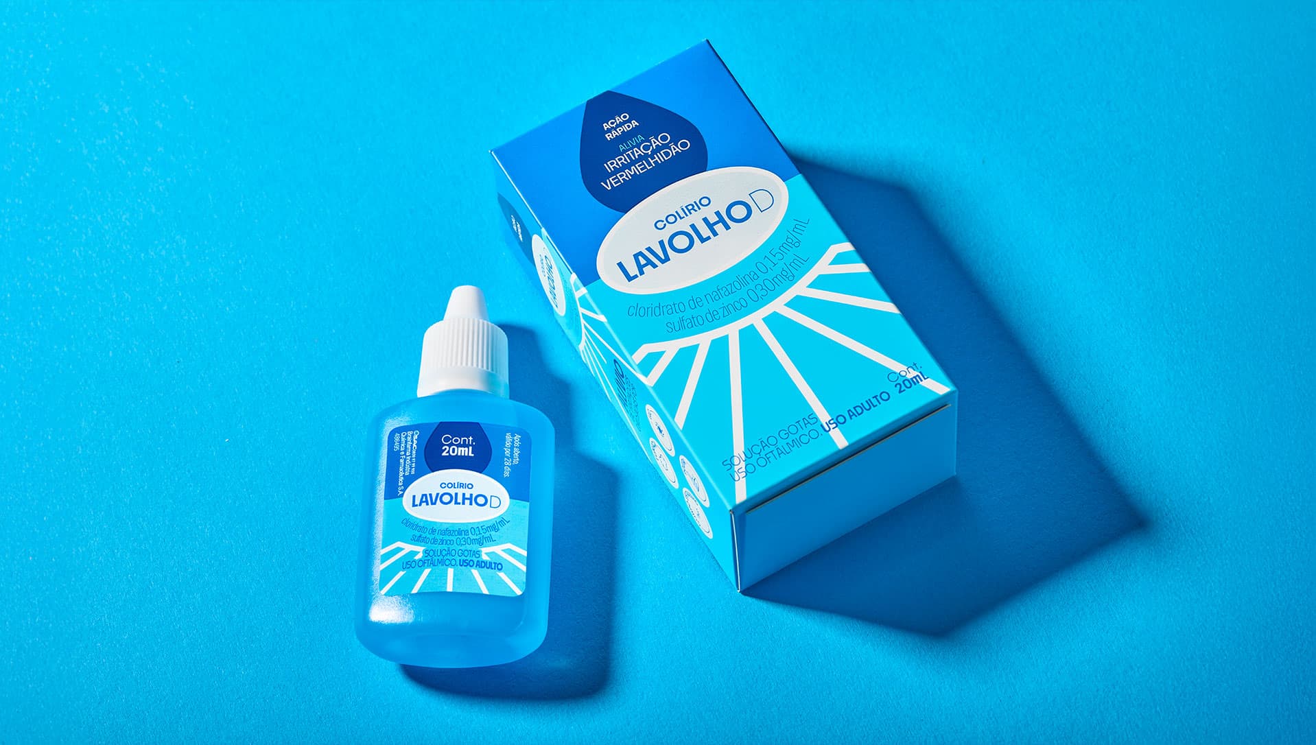
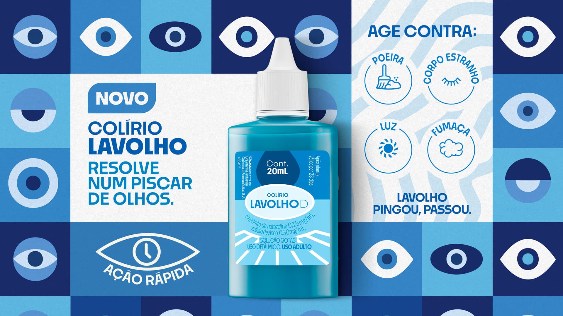
We built a visual identity around a simple, memorable idea: an eye drop falling directly onto the eye, with the eyelashes framing the composition. This became the central graphic element across the brand and packaging. The design system combines a fresh color palette, contemporary typography, and expressive icons, creating a visual language that feels youthful, vibrant, and approachable while keeping the product's key benefits immediately visible.
Results
The resulting packaging creates stronger shelf presence while helping consumers quickly understand what Lavolho is for and why they should choose it. The flexible visual system was also designed to extend naturally across future products within the brand family.
Lavolho uses design to turn a traditionally clinical OTC category into a more clear, engaging, and contemporary consumer experience. By balancing category cues with a distinctive visual language, the brand makes product navigation easier without sacrificing recognition or scalability.
Other projects